



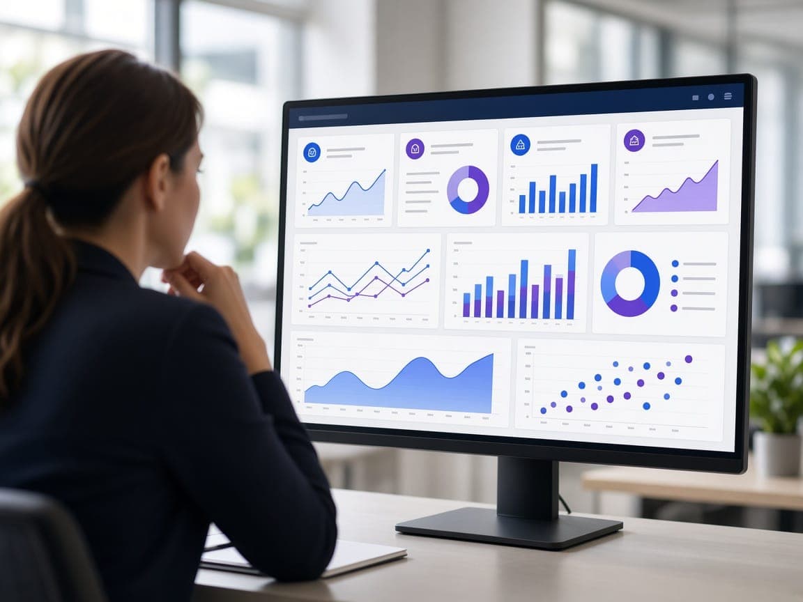
What data analytics is and what it gives a business
Data analytics means bringing together sales, finance, stock, production and marketing data scattered across different systems and turning it into a view managers can actually decide from. The aim isn’t more reports; it’s a timely, consistent answer to the right question.
The benefits show up fastest where reports are rebuilt by hand every month, where departments quote different figures for the same revenue, or where stock decisions rely mostly on gut feeling.
The layers of a data project
The dashboard is only the visible part. If the layers underneath aren’t solid, even the best-designed screen will show figures nobody trusts.
- Data sources: ERP, CRM, e-commerce, ad accounts and spreadsheets
- Data pipelines (ETL/ELT): pulling and cleaning data automatically on a schedule
- Data warehouse: a central store holding data in one consistent structure
- Semantic layer: shared definitions for measures such as revenue, margin and active customers
- Visualisation: Power BI, Looker Studio or custom-built dashboards
Choosing tools and an approach
Tooling should follow your existing ecosystem and the number of users. Power BI is often the natural fit for companies that rely heavily on Microsoft products, while Looker Studio suits Google-centric setups with a lot of marketing data. If dashboards need to be opened up to customers or dealers, a custom interface may be the better route.
Forecasting models only produce meaningful results when there’s enough history and a consistent data foundation. That’s why reliable reporting usually comes first, with demand and sales forecasting following once it’s bedded in.
What affects cost and timeline
The number of sources to connect, and how easy it is to get data out of them, matters most. A system with a proper API is a very different proposition from a legacy system that needs direct database access. Poor data quality, meaning missing, duplicated or inconsistently entered records, adds time for cleansing.
The number of dashboards, user roles and row-level permissions, how often the data needs refreshing and the licensing model all shape the scope as well. Starting with a handful of critical indicators gets the project delivering value quickly.
Common mistakes
The most common mistake is designing dashboards before agreeing definitions. If “sales” means orders to one department and invoices to another, a dashboard won’t settle the argument; it’ll amplify it. Squeezing dozens of charts onto one screen makes decisions harder, not easier.
- Connecting sources straight to dashboards without cleaning the data
- Not naming an owner responsible for each dashboard and its upkeep
- Rolling dashboards out without training the people who’ll use them
- Not setting access rights for sensitive data
How fountr approaches it
We start with a data inventory and a set of key indicators agreed with management. We combine sources through automated pipelines, write the measure definitions down and hand over dashboards together with user training. Once reporting is established, we move on to forecasting where it’s useful.